
Infographics have taken the media by storm. Audience is swamped with text-based content, and businesses are searching for new and innovative ways to communicate their messages. As a result, infographics, with their combination of text and images emerged as a popular approach of mounting above all the noise. This is the age of visual storytelling. With good reason, infographics, if created well, can be extremely effective. Infographics cater to our biologically visual brains and enhance memory. They capture attention and can communicate and simplify complicated messages and meaningfully visualize facts, figures, and data.
However, many infographics aren’t achieving their purpose. If the goals of an infographic are to stand out among all the text-based content and to communicate a message, why less than 1% of infographics see real success when over 10,000 are released online everyday?
This failure is primarily due to poorly created infographics. There’s no doubt that you have seen one, if not dozens, of these. They frequently feature a jumble of text and images, presented seemingly at random, and lacking any structure. Additionally, these infographics often fall short in presenting any meaningful narrative and they attempt to convey too many ideas at once.
To successfully create an infographic, you cannot combine any text and imagery and call it a day. Only when designers truly understand the power of visual communication can their infographics break through. It’s essential to ensure the end result is serving its intended purpose when investing money and time in creating infographics.
Effective Infographics:
Purpose: The purpose for creating the infographics needs to be fully understood. Every infographic should clearly acquire one objective and all emphasis should be placed on that one. Effective infographics focus on one idea and one message. Any more than that will confuse and overwhelm the reader. If there are multiple messages to communicate, they should be broken up into several different infographics.
Goal: The goal of the infographic is what you would like your audience to think and/or react after seeing it. What marketing or sales goals are you trying to achieve with the infographic? And if someone looks at your infographic and remembers one thing about it, what should that be? Align the infographic with your business needs by keeping your goal in mind throughout the design process. Also, a call-to-action is a great way to guide the reader in the right direction.
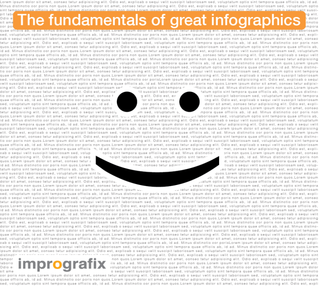
Relevance: The best infographics reveal the personal relevance of the data. Through the strategic use of images and text, infographics communicate the significance of the data in a manner that is more effective than just text on its own. A fantastic example of an infographic is 2 dots and a curved line 🙂 simply creates a smiley face which is one of the most famous infographic in the world.
Narrative: Communicate the purpose/idea through a narrative. The story in the infographic should explain why the data is important. Narrative can also create a logical flow that communicates the intended message the infographic is designed to send.
Visualize: Great infographics use visuals to illustrate what cannot be effectively communicated in words. But too often, infographics feature paragraphs of text next to semi-relevant icons or images. The goal of visualizing information is to emphasize them in a way that can’t be done through text. Also, each piece of data should be relevant to your message. Your infographic is a opportunity to assist your audience in understanding the connections between pieces of data. If your message cannot be visualized effectively, an infographic is probably the wrong format for that particular information.
Simplify: The best infographics feature basic design. Excessively complicated visuals or layout can be distracting and overwhelming to readers. Simple design is often the most effective to clearly convey the intended message.
Aspects to mull over when it comes to simplicity of design:
- Consider the psychology of color in marketing and branding when deciding on colors for your infographics. E.g., Red: Bold, Blue: Strength, Green: peaceful, and so on. You should also consider color preferences by gender.
- White space is essential to effective design. It creates legibility and structure, and also prevent overwhelming the reader with excess information.
- Great typography also promotes legibility. Font selection should be based on the theme of the infographic, and the variation of fonts should be kept to a minimum. Font color should be chosen with maximum legibility in mind.
- Text in the infographic should be kept to a minimum and displayed in relation to relevant images and icons.
- Too much color is distracting. Great infographics keep their color schemes basic (3 color maximum).
- The images and icons used in infographics are often selected to be as simple as possible. Rarely are real pictures used in infographics, and even more rarely are they used effectively.
Types of Effective Infographics
- Maps can be helpful to represent trends across states, countries, or the world.
- Comparisons can be used when distinguishing two or more things; an infographic can help the reader quickly visualize significant differences or similarities.
- Timelines can demonstrate chronological order and represent how events occurred over time.
- Data visualizations is not an infographic, but combining several of them together into a meaningful narrative is.
Adding an infographic to your sales or marketing strategies is an excellent way to communicate important information in a visually appealing and engaging manner. Using this list will ensure that when you’re investing money and time, you’re creating infographics that are valuable and effective.
Please visit us at http://www.imprografix.com/

Reblogged this on imprografix.
LikeLike